
اضافة كره متحركة في خلفية المدونة بتقني عالية

<style>

.pace {
  width: 140px;
  height: 300px;
  position: fixed;
  top: -20px;
  right: -42px;
  z-index: 2000;
  -webkit-transform: scale(0);
  -moz-transform: scale(0);
  -ms-transform: scale(0);
  -o-transform: scale(0);
  transform: scale(0);
  opacity: 0;
  -webkit-transition: all 2s linear 0s;
  -moz-transition: all 2s linear 0s;
  transition: all 2s linear 0s;
}

.pace.pace-active {
  -webkit-transform: scale(.25);
  -moz-transform: scale(.25);
  -ms-transform: scale(.25);
  -o-transform: scale(.25);
  transform: scale(.25);
  opacity: 1;
}

.pace .pace-activity {
  width: 140px;
  height: 140px;
  border-radius: 70px;
  background:#E83E3B;
  position: absolute;
  top: 0;
  z-index: 1911;
  -webkit-animation: pace-bounce 1s infinite;
  -moz-animation: pace-bounce 1s infinite;
  -o-animation: pace-bounce 1s infinite;
  -ms-animation: pace-bounce 1s infinite;
  animation: pace-bounce 1s infinite;
}

.pace .pace-progress {
  position: absolute;
  display: block;
  left: 50%;
  bottom: 0;
  z-index: 1910;
  margin-left: -30px;
  width: 60px;
  height: 75px;
  background: rgba(20, 20, 20, .1);
  box-shadow: 0 0 20px 35px rgba(20, 20, 20, .1);
  border-radius: 30px / 40px;
  -webkit-transform: scaleY(.3);
  -moz-transform: scaleY(.3);
  -ms-transform: scaleY(.3);
  -o-transform: scaleY(.3);
  transform: scaleY(.3);
  -webkit-animation: pace-compress .5s infinite alternate;
  -moz-animation: pace-compress .5s infinite alternate;
  -o-animation: pace-compress .5s infinite alternate;
  -ms-animation: pace-compress .5s infinite alternate;
  animation: pace-compress .5s infinite alternate;
}

@-webkit-keyframes pace-bounce {
  0% {
    top: 0;
    -webkit-animation-timing-function: ease-in;
  }
  40% {}
  50% {
    top: 140px;
    height: 140px;
    -webkit-animation-timing-function: ease-out;
  }
  55% {
    top: 160px;
    height: 120px;
    border-radius: 70px / 60px;
    -webkit-animation-timing-function: ease-in;
  }
  65% {
    top: 120px;
    height: 140px;
    border-radius: 70px;
    -webkit-animation-timing-function: ease-out;
  }
  95% {
    top: 0;
    -webkit-animation-timing-function: ease-in;
  }
  100% {
    top: 0;
    -webkit-animation-timing-function: ease-in;
  }
}

@-moz-keyframes pace-bounce {
  0% {
    top: 0;
    -moz-animation-timing-function: ease-in;
  }
  40% {}
  50% {
    top: 140px;
    height: 140px;
    -moz-animation-timing-function: ease-out;
  }
  55% {
    top: 160px;
    height: 120px;
    border-radius: 70px / 60px;
    -moz-animation-timing-function: ease-in;
  }
  65% {
    top: 120px;
    height: 140px;
    border-radius: 70px;
    -moz-animation-timing-function: ease-out;}
  95% {
    top: 0;
    -moz-animation-timing-function: ease-in;
  }
  100% {top: 0;
    -moz-animation-timing-function: ease-in;
  }
}

@keyframes pace-bounce {
  0% {
    top: 0;
    animation-timing-function: ease-in;
  }
  50% {
    top: 140px;
    height: 140px;
    animation-timing-function: ease-out;
  }
  55% {
    top: 160px;
    height: 120px;
    border-radius: 70px / 60px;
    animation-timing-function: ease-in;
  }
  65% {
    top: 120px;
    height: 140px;
    border-radius: 70px;
    animation-timing-function: ease-out;
  }
  95% {
    top: 0;
    animation-timing-function: ease-in;
  }
  100% {
    top: 0;
    animation-timing-function: ease-in;
  }
}

@-webkit-keyframes pace-compress {
  0% {
    bottom: 0;
    margin-left: -30px;
    width: 60px;
    height: 75px;
    background: rgba(20, 20, 20, .1);
    box-shadow: 0 0 20px 35px rgba(20, 20, 20, .1);
    border-radius: 30px / 40px;
    -webkit-animation-timing-function: ease-in;
  }
  100% {
    bottom: 30px;
    margin-left: -10px;
    width: 20px;
    height: 5px;
    background: rgba(20, 20, 20, .3);
    box-shadow: 0 0 20px 35px rgba(20, 20, 20, .3);
    border-radius: 20px / 20px;
    -webkit-animation-timing-function: ease-out;
  }
}

@-moz-keyframes pace-compress {
  0% {
    bottom: 0;
    margin-left: -30px;
    width: 60px;
    height: 75px;
    background: rgba(20, 20, 20, .1);
    box-shadow: 0 0 20px 35px rgba(20, 20, 20, .1);
    border-radius: 30px / 40px;
    -moz-animation-timing-function: ease-in;
  }
  100% {
    bottom: 30px;
    margin-left: -10px;
    width: 20px;
    height: 5px;
    background: rgba(20, 20, 20, .3);
    box-shadow: 0 0 20px 35px rgba(20, 20, 20, .3);
    border-radius: 20px / 20px;
    -moz-animation-timing-function: ease-out;
  }
}

@keyframes pace-compress {
  0% {
    bottom: 0;
    margin-left: -30px;
    width: 60px;
    height: 75px;
    background: rgba(20, 20, 20, .1);
    box-shadow: 0 0 20px 35px rgba(20, 20, 20, .1);
    border-radius: 30px / 40px;
    animation-timing-function: ease-in;
  }
  100% {
    bottom: 30px;
    margin-left: -10px;
    width: 20px;
    height: 5px;
    background: rgba(20, 20, 20, .3);
    box-shadow: 0 0 20px 35px rgba(20, 20, 20, .3);
    border-radius: 20px / 20px;
    animation-timing-function: ease-out;
  }
}
</style>

<div class="pace pace-active">
<div class="pace-progress" data-progress-text="99%" data-progress="99" style="width: 99.3259%;">
<div class="pace-progress-inner">
</div>
</div>
<div class="pace-activity">
<i class="fa fa-facebook"></i></div>
</div>


العديد من المدونين يرغبون في اخفاء اسم المدون و الاسباب مختلفة منها من لديه العديد من المدونين و منهم من يريد بعض الاحترافية و منهم من يريد ترك القار...Read more »
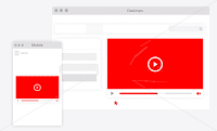
طريقة تغير حجم الفيديو ليكون مناسب مع الجوال لمدونة بلوجر معاينة الاضافة من هناالطريقه :اولا ادخل المدونة المرد التعديل عليه ثم اضغط علي ا...Read more »

ازرار التفاعل دائما ما تكون شئ مناسب للأشخاص للتعبير عن شئ معين مثل ما فى مواقع التواصل وحاليا بشكل كبير على موقع الفيسبوك ، واليوم فى هذا الموضو...Read more »
طريقة اضافة مواضيع ذات صلة بشكل تلقائي وسط المواضيع لتحسين السيو seo وزيادة عدد الزوار ، وقد كنت شرحت في موضوع سابق طريقة اضافة اعلانات ادسنس وس...Read more »

بسم الله الرحمن الرحيم تغيير شكل القوائم المرقمة داخل المشاركات اليوم طلب مني قائمه الخطواط الخاصه بالمدونه فأحببت ان افيدكم بها بأختصار ال...Read more »

بسم الله الرحمن الرحيم تغيير شكل القوائم المرقمة داخل المشاركات اليوم طلب مني قائمه الخطواط الخاصه بالمدونه فأحببت ان افيدكم بها بأختصار...Read more »
إرسال تعليق
جميع الردود تعبّر عن رأي كاتبيها فقط. حريّة النقد والرد متاحة لجميع الزوار بشرط أن لا يكون الرد خارج نطاق الموضوع وأن يكون خال من الكلمات البذيئة. تذكّر قول الله عز وجل (مَا يَلْفِظُ مِن قَوْلٍ إِلاَّ لَدَيْهِ رَقِيبٌ عَتِيد).
EmoticonClick to see the code!
To insert emoticon you must added at least one space before the code.